
If there was any challenge the designers had to bring it, it is this one. Meg knocked her camera challenges out of the park per usual. Karl is coming into his own on the camera challenges. I loved the comment about not wanting to roll out of the loft bed and into the sink. Mark sealed his fate with his trip up on the first camera challenge although his second was as personable as we know him to be.
Side note: was there an unofficial requirement for the designers to hang animal antlers in their houses? I think all three of them had them. For some reason, Karl and Mark’s antler art reminds me of a Jackelope. 

Jackelops are real because they are on the Internet. Look it up.
Photo courtesy of Animal Picture Archive
What Worked
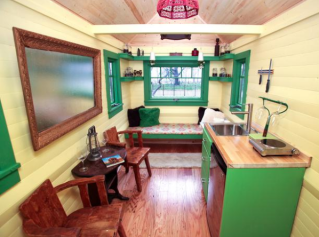
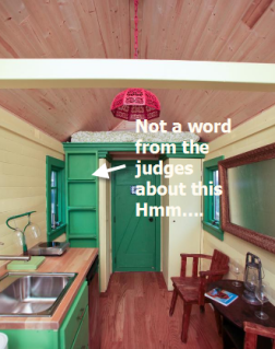
Mark’s attitude. He made a conscious decision to capitalize on his strength - making an art installation using unconventional materials. I was excited to see what Mark had planned for the belts on the wall (love the bear hat too.) Sadly, it did not jive with the judges. I agree that the belts and argyle wall treatment made the space feel more closed in but it wasn't as hideous as they made it out to be.
Meg’s layout and color palette. Almost every judge commented favorably on Meg’s foyer, layout, and color palette - with good reason. The foyer and color palette made the house appear larger. What crack was Vern smoking about Meg’s complete lack of storage? Meg could have easily added more and should have but she was also the only designer that had a closet. Mark and Karl had cubbies and shelves.
Meg's house. Photo courtesy of HGTV
Carmen De La Paz as a teammate. All of the carpenters were supportive and hoped their designer would win the challenge. That desire times 100 and you have Carmen. She saved Mark’s bacon during the carpenter camera challenge when she not so subtly redirected him to talk about what he was going to do to the house. She wanted to help Mark win his dream of an HGTV show so much she got teary talking about it. Wow. Carmen is someone everyone should have in his or her corner. Carmen, I will help you build a pergola by holding cross beams all day any.time.you.asked. just to be around your amazing and supportive self.
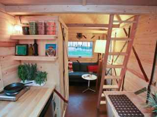
Karl’s double and triple duty everything. Karl put thought into every accessory and item that went into his space. Almost everything did double or triple duty, which as a small house dweller is crucial when you lack space (although my condo isn’t nearly as small as his tiny house.) I think Karl's thoughtfulness is what moved him into the Final Two.
Mark’s kitchen. The styling of Mark’s kitchen made me happy. The orange plants on the wall and the herb garden were living, functional art. Mark manged to design install a large counter top in the kitchen. A definite plus in a small kitchen!
What Didn’t Work
Meg’s lack of storage. Meg had a closet but missed more storage opportunities. Her bench could have easily been a storage bench. I’m surprised that no one had one. The wall above the kitchen desperately needed something - shelves would have fit the bill nicely. Her flip table is a great idea for extra workspace. Again, I’m surprised only one designer had a flip table in their house. The mystery (not really) is judges not calling Meg out for the empty shelves she had on the other side of the closet. If she wasn't the favorite to win, empty shelves would have sent her home. Update: I should never blog precoffee. You are right. Those empty shelves is most likely the loft ladder. Duh.

It's bare compared to the others.
What did Meg spend all of her money on? The rake?
Karl’s high contrast color palette. I appreciate Karl stepping out of his safe and predictable neutral color palette for this challenge. However, as Candice pointed out, the high contrast coupled with the space design made the tiny house feel smaller than Mark’s house that had the same layout (oopsie boys!) Karl packed a lot into his house and it felt claustrophobic to me. Love the ladders though.
The judges reaching for negative comments. All three designs and designers were so close you could tell production told the judges to come up with some negatives they could edit in and fake out the audience on guessing the final verdict. That wasn’t hard given Carmen’s save on Mark’s camera challenge and the constant criticism from the judges that Mark has time management issues throughout the competition. When you are working in TV, your station reads you the riot act if you keep adding extra time to a shoot because your projects take longer than you expect which add unexpected dollars to an already expensive location shoot. There's a reason TV production crews call overtime Golden Time.
Which house was your favorite? Do you think Mark’s wall treatment was as bad as the judges claimed? Did Meg really need deeper shelves for storage after putting a closet into her house? Karl’s ottoman/end table – styled just right or too cluttered? Who do you think will win?
Did you enjoy this post? Get more like it by subscribing to the Condo Blues RSS Feed or to Condo Blues by Email.
No comments:
Post a Comment
I love comments and read them all! If you’re shy and don’t want your opinions made public, you can always email me at condoblues [at] gmail [dot] com.