
This week the designers picked a card, any card and designed
a lounge in that style for a Hollywood Chamber of Commerce party. Basically a
white box challenge with only a floor to
start with.
A few things were abundantly clear from the beginning of the
episode:
- Kris says, “Amazing” a lot.
- Rachel complains about pulling the Victorian style card ALL THE TIME.
And I completely agree with Kris when he said the 1970’s
were a time of pure design tragedy. I don’t agree with the last part of his
statement when he said the 1970’s were also a time of purse design brilliance. Nope,
nay, never, tacky, yuck!
Not that I have a strong personal opinion of 1970's style or anything.
Not that I have a strong personal opinion of 1970's style or anything.
The Good
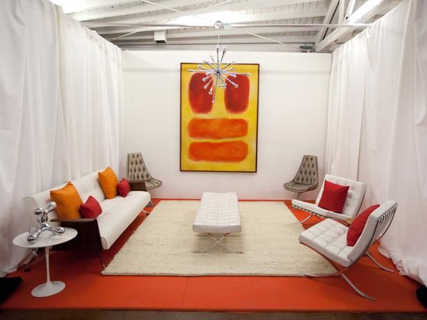
- Mikel’s Mid Century room was good, predictably safe, but sparse on accessories and personality. True, Mid Century style is clean, unlike fussy and can be somewhat too cluttered like Victorian, but it lacked personality which could have been brought in with a few colorful accessories. I like how he punted and used the artwork as a focal point to add more color to the room, which in hindsight he admitted the room needed. Thank you for using a Sputnik lamp in the design Mikel. I loves me a good Sputnik lamp.
All photos courtesy of HGTV
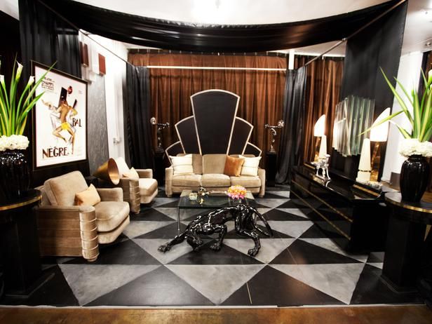
- Danielle’s art deco room. Danielle hit it perfectly. I agree with Vern, the lady lamps are iconic Art Deco as is the artwork she choose. Thankfully, Danielle listened to David and toned down the gold she originally planned which would repeat her white box challenge and might have cost her the win. The panther was unexpected in its placement in the room but I personally flip flop on whether I like it not. What do you think?
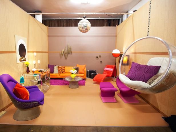
- Hillari’s 80’s lounge didn’t go in the predictable Golden Girls direction of peach, teal, and lots of brass. Kudos to her for subtle homage to various 80’s trends and making them work together in the room. The former purple haired punk rock girl that still lives inside me likes the studded leather accents on the tubes. The green gal that also lives inside wishes they weren’t on PVC.
The Bad
- Rachel’s Hodge Podge of Crap. If Rachel was not complaining about how much she hates Victorian, she was complaining about how much she hates Victorian. She took a risk in trying to modernize Victorian in something less hateful to her but it failed miserably. Genevieve was right when she said the tufted floor looked cheap. However, I think Rachel might have been able to save the room if she went with an over the top cartoony Alice in Wonderland interpretation with cartoony paint on architecture on the walls and possibly furniture. I could have kissed Vern when he described it as, “Victorian version of Papa Smurf’s house." I was surprised they let Rachel stay because I would have tossed her off for that room and her “I’m so glad this is over” comment in her camera challenge. I think the room frame (me likey the idea) and Kris’ history of being little wooden boy during the camera challenges were the only thing that saved her.
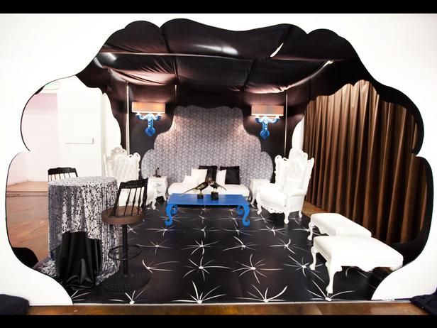
Not having a second curtain wall is just as weird as the out of place bar table and chairs. How the heck is someone supposed to have a conversation with a person sitting on the sofa if they sit on the ottomans?
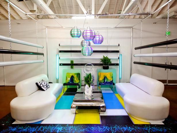
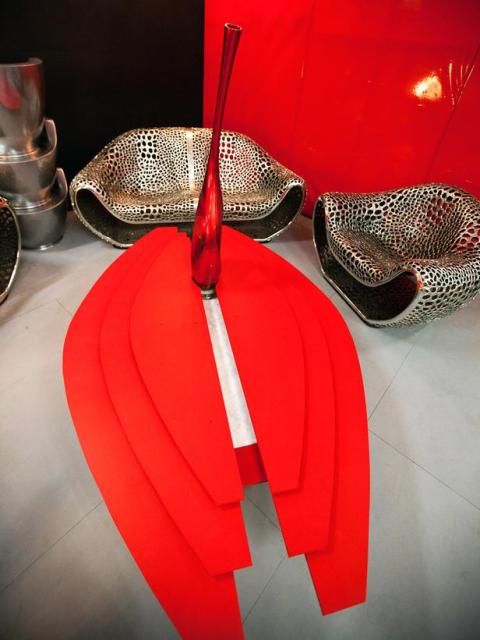
- Stanley's female body part coffee table. He pulled the fun card with Future. The chairs and sofa worked perfectly. The coffee table, however, ugh. I get he was going for a Millennium Falcon shape but it was too large for the space. He should have designed it smaller so people can walk around it. While I want to appreciate Stanley incorporating a purchased object in his coffee table, the design made me want to cross my legs to make sure I wan’t flashing the world the body part the table seemed to emulate. I should also mention I was in alone in my living room and wearing yoga pants at the time.
Yikes!
- Brittany’s camera challenge. Girl, I can relate to rambling and stumbling when you are speaking in public just take a look at some of the videos on the Condo Blues You Tube channel. I um,OK, and repeat words too. NEVERTHELESS, don’t be pissy at Danielle for winning when you blew the win by screwing up your camera challenge. The winner of this competition has to design well AND present well on camera because they win A TV SHOW. You did one but not the other. Sorry.
Next week is the dreaded Kitchen Challenge. Who wants to bet
on the designer that won’t finish their tile backsplash?
Did you enjoy this post? Get more like it by subscribing to the Condo Blues RSS Feed or to Condo Blues by Email.
1 comment :
Personally I think they sent the wrong designer home. I disagree with Vern and Genevive, Kris hit so many nails on the head in his 703s lounge. Maybe it is because sometimes I miss the 70's. Maybe it is because I agree that the 70's are very under appreciated for design. But most likely because he made a design space that I grew up in. My parents basement was pretty much the same as Kris' design- from the Oversized orange couch that mom stuffed in a corner, to the paneling on the walls that my dad was sooooo proud of.
I definitely think Rachel should have gone home. Crap doesn't start to describe it. Painting those sconces was a great idea in anything but that tacky bright blue.
My favorite had to be Danielle's art Deco lounge- followed closely by Stanley's futuristic space- and yes I hearted the coffee table. I saw it as phallic not lady parts.
Loved Hilary's 80's lounge/Hated Hilary's attempts at humor on her Video presentation. I was a child in the in Mid-Century Modern times, Mikel and do not remember anyone with a completely white room, it Needed a fireplace! As for Britany- well my dear, if you are a Regency power house, then I am an underwear model. Quit Whining that you didn't win this challenge, quit whining that you couldn't find the right piece of furniture on day one (and in a prop house- Are you Freking joking?, and finally- QUIT WHINING.
My bet is on Britany to flub her kitchen.
THe more I see Stanley's designs the more he is becoming my favorite.
Post a Comment
I love comments and read them all! If you’re shy and don’t want your opinions made public, you can always email me at condoblues [at] gmail [dot] com.